
Objective 3: Enrich Kassis with Learning Analytics dashboards
The general goal was to capture and exploit interaction traces, so that they could be used by researchers and instructors through visualizations, mainly in the form of dashboards, summarizing the relevant and actionable indicators. Three types of dashboards were envisioned and implemented:
- a research dashboard, aimed at scientists who need to analyze user activity and application usage;
- a realtime dashboard displaying basic information about how the lecture is unfolding, intended to help teachers gain actionable insights into their lectures in real time;
- a retrospective dashboard, meant to be used after a lecture and offering a more detailed view of the students’ and teacher’s activity during the lecture. This dashboard offers a more in-depth perspective, and is intended to support reflective teaching.
2.3.1 Trace modelling (LS2N – Intuidoc – LP3C)
The KASSIS application was analyzed to determine its domain model and identify the various actions and entities involved in the application usage. Using this information, an initial trace model (information schema documenting the usage, with precise attributes) was defined, then refined through multiple iterations. The current model features 53 types of events (combinations of 15 action verbs and 37 object types).
Privacy issues were taken into account in the design of the trace model, in order to restrict the collected data to metadata about the activity. For instance, when logging a user’s pen strokes, we only recorded the bounding box for the covered area and the number of control points (which gives a rough idea of the complexity of the stroke), and not the stroke (content) itself.
Trace modelling was not a single-step process. As the application itself underwent several changes, the trace model had to be modified accordingly. These modifications mostly took the form of additions to the first version of the trace model, so that older traces remained conformant. However, the co-existence of multiple trace versions (considering deployment delays, and preservation of past traces) still requires some post-processing in order to accommodate them.
2.3.2 Trace collection (Kassis instrumentation – Intuidoc)
Once the trace model had been defined, the KASSIS application was instrumented to capture activity traces. The captured traces are sent to a trace server, distinct from the application server, for archiving and processing purposes. In the initial project, anonymization was supposed to occur at capture time. However, experiments showed that teachers sometimes need to identify students during the session, in order to provide adequate remediation measures. Anonymization is now done at the archiving stage, by which time teachers no longer needs to identify students and can use anonymized data to analyze their lectures.

2.3.3 Research dashboard design (LS2N)
A research dashboard has been implemented, so that researchers of the project can explore and validate captured traces, and get insights about the appropriate indicators that need to be presented in the dashboards.

The research dashboard has been continuously used by LS2N to validate trace collection across the various evolutions of Kassis, as well as answer any questions of project partners about the data and the proposed indicators.
2.3.4 Iterative Dashboard Design (LS2N, all)
The dashboards have been iteratively designed using a User-Centered Design approach. We identified multiple scenarios such as using indicators to confirm the teacher’s impressions of a course, so that she can take remediation actions when meeting the students again, or identifying through the class activity (synchronization, note-taking, quiz answers…) the lecture slides or activities that may need to be reworked in future sessions. The following dashboards usage contexts and teacher intents were envisioned:
| Context1: just after a lecture – provide self-awareness for the teacher. In office/at home. Intent1.1: confirm/check a feeling on how the course went (student attention, student activity, too much time spent on a section, memorable good/bad moments/typos) Intent1.2: prepare the following lecture – make decisions: based on the quiz results and other activity indicators, take notes about the things to do for the following lecture. Intent1.3: prepare the following session of the same lecture (for next year, or next week with another group, by the teacher or a colleague) |
| Context2: before the following lecture (with time to act on the content) – review notes/activity indicators and take action.
Intent2.1: remember/check how it went to decide on modifications on content/pedagogical unfolding. The dashboard will provide contextual information to explain the notes taken before. |
| Context3: at the beginning of the following lecture Intent3.1: re-get in the mood by checking the last minutes of activities (slide, quiz, interaction) in the previous lecture + the global feeling of the lecture/group. |
| Context4: any moment during the course (lecture sequence), with other colleagues doing the same course.
Intent4.1: debrief with the colleagues doing the same course to check how it went, give the teacher group a progression awareness. |
From these scenarios, we extracted a number of indicators needed to support the defined tasks. We analyzed the capture possibilities offered by the Kassis instrumentation and identified the trace elements that could be used for building appropriate indicators. We developed the dashboards from these available indicators.
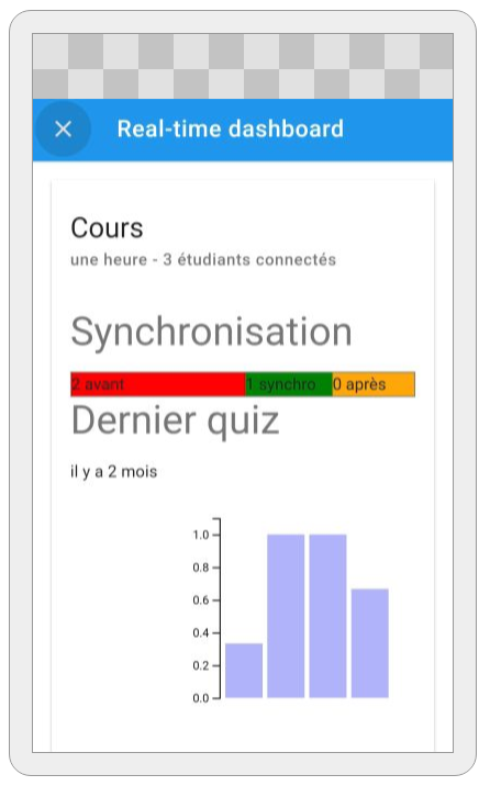
These scenarios constituted the basis on which the first prototypes of the dashboards (real-time and retrospective) were built. They served as a demonstration playground in Study 7 (see below) to bootstrap the iterative design process. The real-time dashboard first prototype used bargraphs to represent synchronization information. They were later changed to simple numbers, easier to read and interpret. The figure below presents the first prototypes of the retrospective dashboard (left) and the realtime dashboard (right):
Study 7: We analyzed the needs of 6 teachers who had already used KASSIS on the interest they might have in the possibility of finding some of this data on a dashboard after their course. Teachers found it useful to use a dashboard, particularly to check whether students generally followed and understood the course well. After developing a first version of the dashboard and 3 prototypes, we interviewed 6 other teachers who had already used Kassis so that they could guide the development. Following these feedbacks we developed a new version which was presented to 3 teachers already interviewed and 1 new teacher who confirmed their intentions of use.
Study 9: After analyzing and confirming teachers’ needs, and developing the appropriate functionalities to answer them (timeline, note-taking, synchronization, quizzes), we needed to test as many course configurations as possible in a realistic way. For example, by encouraging participants to de-synchronize from the teacher in order to explore future slides, or to test all types of quizzes, to return to the course during a quiz, to take different amounts of notes in the course and in the quizzes, to highlight important elements… We therefore simulated a course with the help of 9 participants. Through the different use cases, we validated the data collection, and iteratively improved its presentation in dashboards.
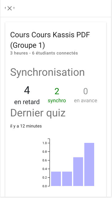
2.3.5 Final real-time dashboard (LS2N)
We implemented the real-time dashboard as a responsive web page appropriate for display on an external device like a supplementary tablet or a mobile phone. 3 types of information are displayed, as presented in the screenshot below:
- the number of connected students (“étudiants connectés”).
- the synchronisation level of the students (i.e. are they looking at the same slide as the teacher, or a previous/following slide). The research hypothesis is that this level is an indicator of the appropriateness of the pace of the lecture: if too many students are looking at a previous slide (label “en retard”), it could mean that they did not finish to assimilate the slides content, and thus the pace is too fast. If they are looking at the following slides (label “en avance”), it may be an indicator that they feel they already understood the current slide content.
- the results of the latest submitted quiz (label “Dernier quiz”).
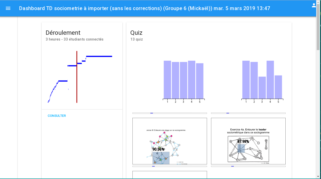
2.3.6 Final retrospective dashboard (LS2N)
The retrospective dashboard is meant to be used after a lecture, in order to get an overview of the course unfolding and of some of its characteristics.
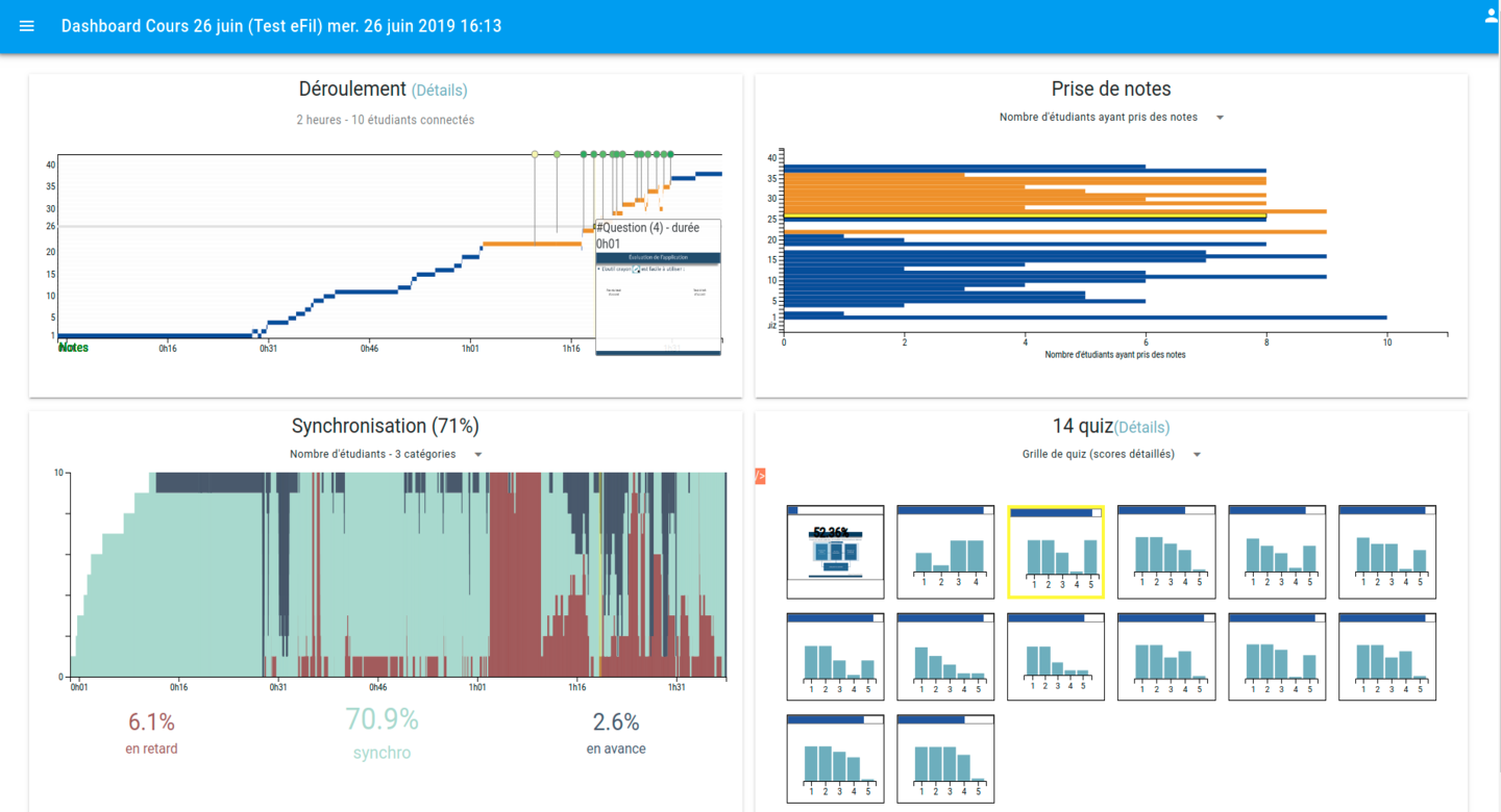
The figure below presents various components.
In the top left corner, the Déroulement (unfolding) card presents a view of the progression of the course, with course time on the x-axis and slide number on the y-axis. It can provide multiple insights such as identifying longer slides, assessing whether the slides where shown in their anticipated order, when quizzes were presented…
The Prise de notes (Note taking) graph in the top-right corner presents, like the previous graph, slide numbers on the y-axis. It features different indicators on the student note-taking activity on slides: how many students annotated each slide, what time was spent annotating the slide overall…
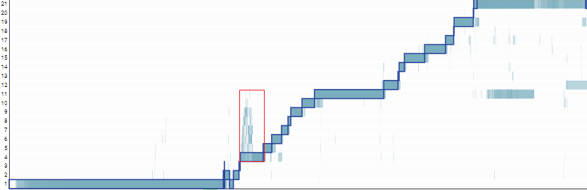
In the bottom-left corner, the Synchronisation (synchronization) graph gives an overview of how students were co-watching the slides. Students that consulted the same slide as the teacher are shown in cyan. In red, we show the number of students that are still consulting a previous slide, while in blue we show the number of students who are consulting a following slide. This can give a hint on the appropriateness level of the lecture.
Eventually, the bottom-right Quiz graph presents an overview of the different quizzes that were submitted during the lecture.
From the main dashboard interface, the user can access more detailed views, such as an enriched version of the timeline that, in addition to the slide progression of the teacher, also displays information about the slide progression of the students. This allows to more precisely analyse de-synchronization behaviours that can be detected through the Synchronisation graph. For instance, in the figure below, the detailed timeline (clock time on the x-axis, slide number on the y-axis) represents the teacher slide views with a blue border and no background rectangles. Student slide accesses are represented by rectangles with a blue background color, with transparency, which allows to identify students paths/behaviours during the lecture. We can see (highlighted by the red rectangle below) that at some points, multiple students explored slides following the teacher slide. The teacher concerned with this session confirmed that this was an expected exploration behaviour at this point, consequence of a given pedagogical instruction.
Study 10 The KASSIS application and dashboard have been tested in a non-simulated classroom setting, with an experienced teacher, who already used animation techniques such as quizzes and converted his course to use the features of the KASSIS platform. The goal was to obtain realistic traces from teacher and students, in order to evaluate both application and dashboard. The teacher and 33 students were equipped with tablets, and were asked to use it to take notes, answer quizzes, etc. during 2 lectures and 1 session of supervised work. Technical issues prevented a real use of quizzes. Nevertheless, we were able to capture the interaction traces of navigation and note-taking, which we are currently analyzing to find pertinent information. A post-experiment interview with the teacher provided more feedback on the application features and the information presented in the dashboards. Despite the technical issues, the application was recognized as having interesting potential. The dashboard allowed to confirm some of the teacher’s impressions.
2.3.7 Learning Analytics (LS2N)
Beyond displaying information in dashboards for teachers, we want to analyze the learning traces to find out in what measure the collected data can be used to automatize the detection of significant events or behaviours.
One goal of our analysis was to check whether different profiles could be emphasized among the students. Such a task consists in first generating a set of input features from the raw data set, then applying a clustering algorithm. Two propositions are currently in progress to build the profiles, based on different input features:
- basic independent features
- time series
For the first solution, we rely on a common approach in learning analytics that consists in providing a set of independent features obtained from the raw traces. These features concern for instance the percentage of slides with annotation, the intensity of writings or the average time spent on the slides. A visual analysis of all the features was first carried out and a Principal Component Analysis was applied. A problem here is that the dimension of the features can quickly exceed the number of observations, leading to the problem of the curse of dimensionality.
The second solution relies on the generation of a time series per user. Such a time series contains the sequence of actions carried out by a user. We encode the information so that at each time t, a user can be inactive or doing the actions access, write or answer (the answer action is the action of answering a quiz). A hierarchical agglomerative algorithm is then applied on the set of time series. An example of a clustering result is provided in the figure below. It was obtained on a course with 3 sessions and 14 users. 4 different profiles are emphasized by the agglomerative algorithm and color-coded in the figure. For instance, the group of two users on the right (color purple) seems to present the comportement to quickly switch between access and writing actions all along the sessions. But it is hard to conclude that it is a common profile for students, by lack of data.
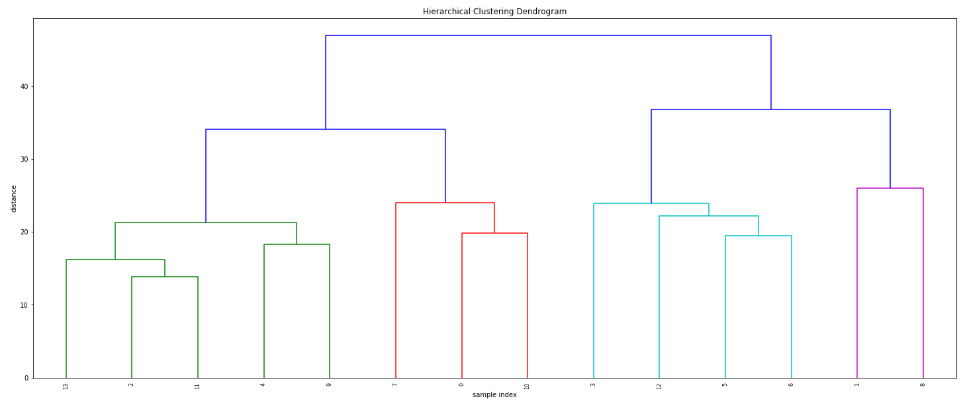 The small amount of data available right now does not allow to give conclusions on the evidence of several distinct user profiles. Few courses are available and each one is composed of few sessions. Previous results with time series solutions in other contexts are nevertheless encouraging, and incite us to do a more in-depth analysis. On of the first improvements should be the building of larger datasets.